Geotimes

Geologic Column
The Gettysburg Address on
Power Point
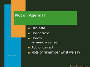
What Lincoln really said: But, in a larger sense, we can not dedicate
— we can not consecrate — we can not hallow — this ground.
The brave men, living and dead, who struggled here have consecrated it,
far above our poor power to add or detract.
From www.norvig.com/Gettysburg; courtesy of Peter Norvig. |
The Pitfalls of PowerFluff
Lisa Rossbacher
I knew I hated PowerPoint, but it took Edward Tufte to help me understand why.
The moment when I knew, for certain,
that I held a deep animosity toward the
prepackaged presentations was several
years ago when I met with the newly elected
student government leaders on campus.
They were taking over an organization
that was on the brink of making a real difference
on campus — they had momentum,
energy, diversity and a plan. They
were ready to share it with me.
And then they allowed the PowerPoint
software to eviscerate their vision, reducing it
to meaningless bullets and lists on slides that
they proceeded to read aloud to me. The
presentation sucked the meaning out of what
had started as an important message, and the
plan was reduced to a list of platitudes.
We’ve all seen the same thing happen in
professional talks that use PowerPoint software
to organize information and show
data. Good data get lost, or we are never
able to determine their value. The lists of
bullet points all look the same, with charts
that plot a couple of data points against an
unlabelled y-axis.
Four score….
Edward Tufte has been called “the
Leonardo da Vinci of data.” He is the author of The Visual Display of
Information, Envisioning Information and Visual Explanations:
Images and Quantities, Evidence, and Narrative. His one-day courses, offered
around the country, draw geologists, economists, biologists, politicians, marketing
executives and many students. His message is that good content is critical for
good presentations, but poor display of the information can kill great content.
During a workshop last summer (June
2003), Tufte observed that PowerPoint is a
method of presentation that is corrupting
serious thought. Most meetings with
PowerPoint, he argued, result in detectable
intellectual damage; the harm done to statistical
data is enormous.
One issue is the loss of detail in
PowerPoint graphics. For example, an
average graph in Science has more than a
thousand data points in it. A graph in The
Wall Street Journal has more than a hundred.
One in a newsmagazine such as Time might
include 40. A typical PowerPoint graph
(based on a study by Tufte of 28 textbooks on
PowerPoint presentations) has 12 data
points. (In 1982, the Russian newsmagazine
Pravda had five numbers per graphic image.)
As Tufte says, “Serious data need serious
graphics.” PowerPoint doesn’t measure up.
Similarly, a typical PowerPoint slide has
40 words. An 11- by 17-inch paper handout
can hold 30 to 50 times as many. Which is
the richer presentation?
An example of the loss of clarity that
comes with PowerPoint-imposed structure
is how it was used to analyze the Space
Shuttle Columbia disaster. Tufte describes
it this way: “in a PowerPoint festival of
bureaucratic hyper-rationalization, 6 different
levels of hierarchy are used to classify,
prioritize, and display 11 simple sentences.”
The data, interpretation, conclusions
and responsibility were all lost in a
jumble of acronyms, modifiers and bullets.
Another issue is the homogenization of the
presentation. Unless the user is vigilant,
PowerPoint will reduce the content to the
lowest possible denominator. The most
dramatic (and entertaining) illustration of
this is in Peter Norvig’s take on Abraham
Lincoln’s Gettysburg Address — reduced to
a PowerPoint presentation. For its full
effect, imagine Lincoln muttering under his
breath at the beginning: “This didn’t happen
when I practiced … maybe I’m going to
have to reboot … I should have gotten a
Mac.” As in my opening example with the
students, PowerPoint can drain significance
out of even one of the most eloquent speeches
in the English language, making it
PowerFluff.
A time and place for everything
PowerPoint is not worthless. There is at
least one valid use for PowerPoint — as a
slide projector, a holder of relatively low-resolution
images so that they can be projected.
Tufte acknowledges that PowerPoint is a
good way to present images that should be
accompanied by data on a paper handout. He
admits this in his essay The Cognitive Style of
PowerPoint in which he gives some excellent
advice about how to improve presentations.
These suggestions largely involve minimizing
the amount of control you allow PowerPoint to
have in organizing and presenting your information.
He also mentions one of the single
most important pieces of advice ever offered to
a speaker: Never read your slides aloud.
Rossbacher, a geologist, is
president of the Southern Polytechnic State University in Marietta, Ga.
For more about Edward Tufte and to read some of his essays, visit www.edwardtufte.com.
Back to top
