
Such demand is not unusual given current interest in making policy decisions based on science. But doing so often requires that we ask broad-brush political, economic and public health questions of natural resource data collected for highly specific research purposes. Sometimes we simply don't have the right kind of data to answer all of the questions; other times, the problem is to communicate the data in the right form.
This conundrum is particularly true for maps. Before trying to answer many different questions with one map, we should consider three "user beware" issues germane to any map of data.
Why was the map created?
The ongoing process of revising the federal limit for arsenic in drinking water is a classic example of a tangle of interrelated questions and data open to many interpretations. Widespread, high concentrations of arsenic in groundwater are generally attributed to natural sources. National regulatory and legislative bodies need to know which parts of the country have high arsenic in drinking water; how serious an effect arsenic may have on public health; and where reducing arsenic concentrations will be most costly. Maps of existing water-quality data can clarify these issues, but creating the right map is not simple.
If the question is, "Where are the most people exposed to arsenic?" the resulting map might point to areas of dense population relying on large public water supply systems. To answer, "Where are people exposed to the highest levels of arsenic?" a map might finger rural areas where private wells containing high arsenic concentrations commonly go untreated. A map answering, "Where will reducing arsenic be most costly?" could identify areas with the greatest number of wells high in arsenic; or where high arsenic occurs with high sulfate; or where drilling new wells may be required. These different "treatment cost" maps may not point to the same areas that other maps highlight to show the "most population" and "highest arsenic."
What data underlie the map?
Two primary data sources provide information on arsenic in drinking water for the United States. Compliance monitoring programs are the first source. Public water supply systems are required to monitor for compliance with legal water-quality standards. The U.S. Environmental Protection Agency (EPA) has compiled a data set of arsenic measurements from 20,000 monitoring programs in 25 states. Leaving aside issues of data comparability, this data set provides an important basis for estimating how many public supply systems have high concentrations of arsenic, or what proportion of the urban population drinks from high-arsenic public systems.
However, no analysis of this data set can answer a slightly different question: Where in the country are the most people at risk from arsenic? The EPA data set contains no explicit information on the rural population that doesn't use the public supply. More than 99 percent of this population relies on groundwater for drinking water. Because private wells are unregulated, no national regulatory database exists to fill this gap.
The other data source is environmental research programs. The USGS has compiled a data set of arsenic measurements from 31,000 wells and springs in 49 states. Scientists with the USGS and state agencies collected and analyzed these data mainly from private, domestic wells, as well as monitoring wells and public supply wells. These samples were collected for studies on the quality of the country's potable groundwater resources, also called source water or raw water. Like the EPA numbers, these measurements cannot stand alone as the only source of data on arsenic in drinking water. These groundwater samples may accurately represent the drinking water used by rural homeowners and small suburbs, but may not represent urban public supply systems' water if the utility mixes groundwater with surface water before delivering it to consumers.
Clearly, a map using just one of these data sets can answer only a limited set of questions. Combining the two data sets could provide a view of where arsenic is high in both public water systems and private wells, but still wouldn't give a complete picture of health risks. Lifestyle, genetic and environmental factors make certain members of the population more susceptible to health effects from drinking high-arsenic water. In addition, such factors may have geographic patterns that could complicate the analysis of relationships between arsenic in drinking water and health effects. For example, smoking rates vary geographically across the country, and arsenic may not be the only contaminant occurring in a region's drinking water.
How was the map made?
Even given a well-defined question and an appropriate data set, the visual and statistical techniques used to summarize data can make a great difference to interpretation. Often, interpreting the data requires extrapolating from discrete points to larger areas.
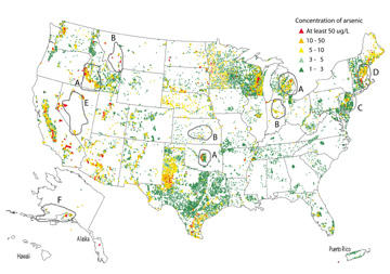 Figs. 1, 2 and 3 show
three approaches to the question, "What percentage of private wells in
various regions have high arsenic concentrations?" These figures use only
the environmental-research data.
Figs. 1, 2 and 3 show
three approaches to the question, "What percentage of private wells in
various regions have high arsenic concentrations?" These figures use only
the environmental-research data.Fig. 1 is a point map. This is the most common way to show raw data, but interpreting point maps is not straightforward. The human eye is not good at estimating the proportion of high vs. low values in an area, and point maps exacerbate this difficulty. Wells that are close together are drawn on top of each other. The higher concentrations, indicated by red triangles, are drawn on top of the moderate concentrations, which in turn cover up the lowest concentrations.
[Figure 1 is a point-map that shows locations and arsenic concentrations for 31,000 wells and springs sampled between 1973 and 2000 (updated from Welch et al., 2000)]
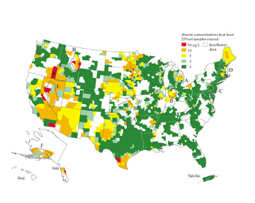 summary
statistic used for this kind of map is an average concentration per region.
In this case, the arsenic data set has a statistically skewed distribution with
a few very high values, so the average concentration of arsenic would be biased
high instead of representing the true center of the data. Presenting percentiles
of concentration, such as the median (50th percentile), avoids this bias. Fig.
2 presents the 75th percentile of arsenic concentration per county, which supports
such statements as "75 percent of wells sampled in County X had arsenic
concentrations below 10 ug/L," or, "25 percent had arsenic concentrations
of at least 10 ug/L." (Note that proportions were only computed for counties
with at least five wells.)
summary
statistic used for this kind of map is an average concentration per region.
In this case, the arsenic data set has a statistically skewed distribution with
a few very high values, so the average concentration of arsenic would be biased
high instead of representing the true center of the data. Presenting percentiles
of concentration, such as the median (50th percentile), avoids this bias. Fig.
2 presents the 75th percentile of arsenic concentration per county, which supports
such statements as "75 percent of wells sampled in County X had arsenic
concentrations below 10 ug/L," or, "25 percent had arsenic concentrations
of at least 10 ug/L." (Note that proportions were only computed for counties
with at least five wells.)
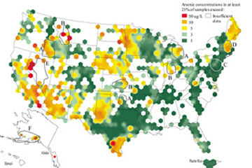 One way to solve
the problem of varying region sizes is to impose an equal-area grid on the data.
Grids can be many shapes. Fig. 3 uses equal-area hexagons 100 kilometers across
- the median size of a U.S. county. Like Fig. 2, the 75th percentile of arsenic
concentration was computed only for hexagons with a minimum data density of
five wells per hexagon. To improve on Fig. 2, Fig. 3 shows a moving 75th percentile
that has been "smoothed" across hexagon boundaries based on neighboring
values. Using equal-area hexagons makes the data densities more comparable among
regions, and the smoothing prevents the artificial "jumps" in concentration
that occur between counties in Fig. 2.
One way to solve
the problem of varying region sizes is to impose an equal-area grid on the data.
Grids can be many shapes. Fig. 3 uses equal-area hexagons 100 kilometers across
- the median size of a U.S. county. Like Fig. 2, the 75th percentile of arsenic
concentration was computed only for hexagons with a minimum data density of
five wells per hexagon. To improve on Fig. 2, Fig. 3 shows a moving 75th percentile
that has been "smoothed" across hexagon boundaries based on neighboring
values. Using equal-area hexagons makes the data densities more comparable among
regions, and the smoothing prevents the artificial "jumps" in concentration
that occur between counties in Fig. 2. 